This post originally appeared on Novice No Longer.
My first OS X app, WorkBurst, is now available in the App Store! To celebrate, I want to share with you my entire process, from idea to app release. I did everything without writing a single line of code. The total cost? $304.
The most important lesson here is that you don’t need to learn how to code to make apps. You should learn to code if you want to know how to code. If you want to make apps, there are other, more direct paths to take.
Here’s mine.
The idea
Some of my favorite apps are the most basic. I use Quiet to block out off background applications and Freedom when I don’t want to be distracted by the internet. Neither are complicated apps. They do their job, and do it well. That’s it.
I wanted a Pomodoro timer app that did the same thing. See, I have a hard time focusing when I have large tasks looming over my head. The longer the article, the worse I get. I’ll stall and pace and browse Twitter and make myself completely miserable.
At times like this, the only thing that helps is the Pomodoro technique.
I’m by no means a lifestyle Pomodoro master. It’s not something I use every day. I don’t break out my tasks into Pomodoro segments in order to plan my day. But if I’m working long hours on a tight deadline, the Pomodoro structure is the only thing that gets me through the task.
But when I searched for a good Pomodoro timer, everything I found was filled with settings, options, lists, and complications. I wanted to be able to just start a timer and go. My problem was that I kept getting distracted, and searching for the right timer and messing with all the settings was just another distraction itself.
I knew I couldn’t be the only person who wanted an app like this. So I decided to make it myself.
Another important feature I wanted the app to have was to dim the screen during breaks. I have a terrible habit of never looking away from the screen. I didn’t want the screen to go completely dark during breaks, but bringing the brightness down to about 20 percent encourages me to get up and look away from the screen.
Thus, the idea for WorkBurst was born. Since I don’t know how to code, here’s how I went from idea to App Store.
Development
A little over a year ago, I stopped teaching myself how to code. By that point, I had made my way through Programming in Objective-C by Stephen Kochan (highly recommend) and was partly through the free iPad and iPhone Application Development Stanford class by Paul Hegarty in iTunes U. I was understanding everything and making good progress.
But then I had a realization: coding was not how I wanted to be spending my time. I wanted to make apps, not code apps.
I don’t regret the time I spent learning to code — it’s given me an appreciation for development work as well as the skills to intelligently communicate with programmers. But I’d much rather pay someone to spend 10 hours of work instead of trying to do it myself, taking two months, having a worse product, and saving the money.
Fortunately, I already knew a fantastic developer from when I built my first iPhone app. I shot him a quick email asking if he was still available for work and if he was able to do OS X apps in addition to iOS apps. He wrote back in a few hours, saying yes and yes.
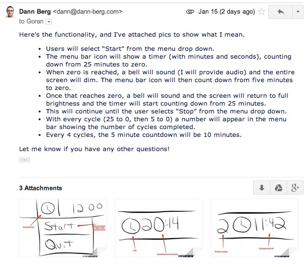
Next, I drew a couple of sketches using FiftyThree’s Paper on my iPad mini and shot him a quick summary of the app’s functionality.
 ]
]
I had a response the next day, saying that this app would take five hours of work. My developer, Planet 1107, charges $40 per hour (and if you follow that link, you’ll save an extra 10 percent off). The development work would would cost me $200.
Design and Assets
Next, I had to find a task bar icon for the app as well as the sound effect to alert the user when the break starts and stops.
For the icon, I used Iconfinder and set the search parameters to only show free icons that were available for commercial use. I used Freesound for the alert sound, also making sure I had the proper permission to use the asset in a commercial product.
After sending those to the developer, we had many five or six more emails hammering out the details. I was sent version one of the application the following day (how’s that for a fast turnaround!?) and I sent him back my comments. We went back and forth a few times before the app was just right.
Next, I needed an app icon. I jumped on Fiverr and searched for designers with experience making iOS 7-style icons. I found someone I liked and bought the gig. In the instructions field, I included a concept I had in mind (maybe a clock inside a lightbulb?) as well as a few colors that I like. I based the colors on the palate I chose for Novice No Longer.
The icon was finished in a few days, and I absolutely loved it. I had a couple of changes, and the revision was returned the next day. Beautiful.
Submitting the app
While I could have used Planet 1107 to help me provision and submit WorkBurst to the App Store, I decided to do it myself. The first order of business was to purchase a Mac Developer Account, which costs $99 per year.
Just like with Reader Tracker, I tried to do the provisioning myself, but just found it too confusing. I set up a meeting with my friend and iOS developer Will Larche, and he helped me create and download the proper distribution profiles, and get everything set up properly in Xcode.
Next, I wrote the app description and researched the best keywords to use. I took screenshots using Skitch (the old version, before it sucked) and edited them in Photoshop CS6 (although Pixelmator is a fantastic and inexpensive alternative that would also work).
I submitted everything to the App Store, but chose a release date far in the future. This is because I wasn’t sure how long the app review process would take and I wanted to orchestrate a number of events around the launch.
Once everything was submitted, all I had to do was wait. WorkBurst was approved in about four days, so not long at all. Everything was all set to go live, now it was time to get press.
Marketing
In terms of press, I decided I didn’t want to do an all-out assault on every productivity blog imaginable. If this was a much larger and more important app, I would have made a list of every productivity blog I could find and send them each a personalized letter. Instead, I only targeted a few that would have the biggest impact.
The websites I decided to contact were:
- LAPTOP Magazine
- Lifehacker
- TechRadar
- Business Insider
- BusinessNewsDaily
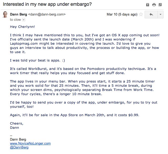
I first reached out to Cherlynn at LAPTOP Magazine, who I learned is the writer who covers apps. I had mentioned the app to her before in passing, so my main goal was to give more details and gauge interest. Note too, this was a pitch to someone I already knew — if this was a cold email it would have been worded slightly differently (as I cover in Turning Emails into Press).

She got back to me the next day and wanted to schedule a demo of the app, since she knew that I live nearby. I gladly agreed and came in the following afternoon. The app demo turned into an interview, and Laptop Mag also shot a video. Fantastic!
The next publication I contacted was Lifehacker, since they love sharing new productivity tools with their readers.
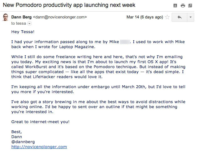
I was given the name and email address of an editor there by a friend. Here’s what I wrote:

You’ll notice I made two attempts here. The first was explaining my app, making it short and sweet. I also ended the email with a possible article pitch. If they weren’t interested in my app, maybe they’d like some longer content.
It turned out to be Tessa’s last day, but she forwarded my email to another editor. This editor cc’d another writer to check out WorkBurst and said he was interested in my pitch.
The writer agreed to honor the embargo, I sent over all the information about WorkBurst (still a conversational email, not an official press release) along with a link to the app for the writer to try.
I sent my pitch to the editor (each of the five ways to stay focused while working online along with a brief description of each) but he politely declined the piece.
The rest of my outreach was less successful. I pitched TechRadar, and he seemed intrigued but there just wasn’t a good place to publish the article.
For Business Insider and BusinessNewsDaily, I changed the angle of my pitch. Rather than promoting a new productivity app, I talked more about myself and my entrepreneurial journey. I offered to share how I went from working retail full time when I released my first iOS app Reader Tracker to teaching others how to do the same.
Business Insider never got back to me, and BusinessNewsDaily wasn’t interested in the piece, but offered to do a profile on me as an entrepreneur. I’m definitely taking advantage of that, although I haven’t had the time to fill out the full form yet.
Release Day
And the app is live!
The App Store lets you set the day of release, but not the time. As a result, new apps are available at midnight in each respective timezone around the world.
I woke up in the morning and made sure the app was actually available. Then patiently waited until 8:00am to see what coverage there was.
Here’s what’s been published so far, and I’ll be updating this throughout the day:
Here’s my total costs:
- Development: $200
- Artwork: $5
- Mac Developer Program: $99
- Total: $304
If you want to try out WorkBurst yourself, it’s only $0.99! Available NOW in the App Store!